Create once,
Publish Everywhere
Wes Bos
wesbos.com
@wesbos
June 5, 2013
Wes Bos
wesbos.com
@wesbos
June 5, 2013
I tweet: @wesbos
I blog: wesbos.com
Also on LinkedIn linkedin.com/in/wesbos
Independent, so you can hire me. I work with everyone from startups to large companies.
Strong focus on the front end working with HTML5, CSS3 and cutting edge JavaScript.
That means I spend a lot of time with mobile devices.

Hands-on, project-based learning from industry-leading professionals.
I lead the HTML, CSS and Responsive Design 72 hour course.
HackerYou.com
Women-run not-for-profit group working to empower everyone to feel comfortable learning beginner-friendly technical skills in a social, collaborative way.
I teach the single-day WordPress for beginners workshop.
LadiesLearningCode.comHow we get today's web on all devices using...
Let's take a look at the past of the mobile web.


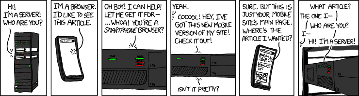
Mobile devices had exploded in popularity leaving content publishers scrambling to provide a good mobile experience.

“The website does not fully support your browser, and you may encounter problems during your visit.”
Starting with not being able to read this dialog box or touch the tiny button.


or Let's build two websites!
Once content producers caught up with Wave #1, the next logical step was to start building a mobile website
An mdot website, is a website that users are redirected to, usually hosted at m.websitename.com
This is an entirely separate website aimed to provide a better experience for users on small smartphone screens
Two websites is twice as much work to build and maintain
You must maintain a list of mobile phones and redirect users accordingly. New phones come out every day.
We have all experienced this pain:
Each article now has two URLS, bad for SEO
Mobile articles get shared to twitter,
desktop users read them.
People assume the iPhone is the onlyPhone™
Oh shit, tablets happened. Do we need t.yoursite.com?
As you can see, mobile websites were a good interim solution, but as the device landscape continues to grow, its not feasible to be maintaining multiple websites.
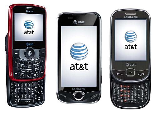
There are way too many mobile phones to try and target all of them individually
Oh yah, and tablets too

...and e-readers

Grandmas and Developing countries
are still using feature phones
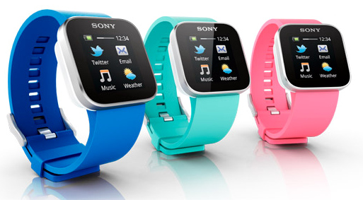
And now everyone has Internet on their TV

The possibilities are endless

Oh yah, these too.

A responsive website is a site with a single codebase that adjusts its layout based on the current device's attributes. The most notable one being the device size.
This means that whatever size of device the user is on, it should still provide the same content with a tailored experience
For your content.
Images, headers, paragraphs, links, navigations.
For your design and layout.
Colours, fonts, widths, heights, grids, layouts + anything that relates to how it looks.
At different points in the browser size, we want to apply and unapply different bits of CSS that control how the page is laid out.
For example, on the desktop we may be able to fit 4 columns of content, while tablet in portrait mode only can handle 2 and a mobile phone looks best with a single column of content.
Let's take another look at http://www.bostonglobe.com/
The way we do this is with part of CSS3 called media queries.
They allow us to restrict parts of our CSS to only specific ranges of screens
@media (max-width:940px) {
  /* All your CSS goes here */
}
This targets all devices with a screen width of 940px or lower
So, a website with 4 columns of content may look like this:
.column { /* 4 Across */
  width:25%;
  float:left;
}


@media (max-width:768px) {
  .column { /* Go 2x2 when we reach tablet size  */
    width:50%;
  }
}


@media (max-width:480px) {
  .column { /* Go 1x4 when we reach phone size  */
    width:100%;
  }
}
@media (max-width:768px) and (min-width:480px){
        ...
      }
Anything smaller than 769px and wider than 479px
@media (max-height:400px){
  .largeHeader {
    display:none; /* Hide large header on small devices */
  }
}
@media (orientation : landscape) {/* Styles */ }

Pixels are an odd thing that don't necessarily correspond to the size of the screen. Your 50 inch 1080p TV at home is 1080px high while my measily 9 inch ipad is 1536px wide.
Lately devices have come out that are what we call HiDPI or High Density Pixels. You have probably heard the marketing term 'Retina screen' when referring to apple devices.

What does this mean? The amount of pixels on these devices are doubled and crammed into the same physical size of screen.
This is why buttons, images and logos sometimes look fuzzy on your iphone/android phone with HiDPI screens.
We can use a media query to target devices with a high device pixel ratio. This ensures crisp images.
.myButton {
    background:url(images/buttonBG.png) center no-repeat;
}

@media only screen and (-min-device-pixel-ratio: 2.0) {
    // feed HiDPI screens a bigger background image
    .myButton {
        background:url(images/buttonBG@2x.png) center no-repeat;
    }
}
I know most of you aren't developers, but CSS media queries are so simple that non-developers can easily read them and understand them.
The MagNet site is extremely simple, more content heavy sites will take more planning.
However, if planned properly, making a website responsive doesn't increase the workload by too too much.
Now, with media queries, we could have 4-5 slightly different layouts! Who designs them? That is 4-5 times the work for everyone!
Design process is changing, HTML and CSS are now tools that designers should be using. If your designer doesn't know how to code HTML and CSS, they should start learning today.
Prototyping designs in the browser allows you to quickly mock up potential designs at all screen sizes.
Animation and interaction is crucial in today's interfaces, these things cannot be easily conveyed to a developer with photoshop or illustrator.
Move into the browser sooner. Designers working in the browser have a much better idea of what is possible, this translates to a much better experience.
Since designs need to respond to many different screen sizes, many designers are opting for a simple design with heavy focus on large images and clean lines.
Building a website on a grid system allows for greater flexibility when scaling your site up or down.
Gradients, shadows and complex layouts are slow.
Think about your users when they are on on touch devices. Dropdowns don't work.
Tools to make going responsive easier
Hit the ground running!
Writing CSS is slow, get some help!
See what the latest and greatest are doing
Add some interaction
Some tips from the current scene of HTML5 & CSS3
Simple is faster, simple is intuitive, simple is better.


If you have to ask, you are doing it wrong!


Mobile devices aren't going away and are now even replacing desktop computers.
A solid responsive site will be the foundation for your web experience for years to come.
Follow @wesbos / Handshake on LinkedIn
Thanks!